5 Interior Design Tips & Talking Space
Designing an interior space is much like designing digital graphics for a brand. I go for a mixture of structure and fluidity, combined with color theory and balance. I infuse my personal style while paying homage to the elements I am using. Most importantly, I look to achieve a sense of thoughtful, positive emotion in the overall design.
My husband and I recently purchased our first home, and to say it’s been fun decorating is a total understatement. In a few words, our style could be described as Warm California Minimalism. We strive for a timeless aesthetic with a minimal amount of decor, and we certainly don’t mess with clutter. Drawing inspiration from beautiful architecture in California and Byron Bay gives us the natural, holistic look we’re after for our slow-paced lifestyle here in Ohio.
READ ON FOR 5 TIPS
I SWEAR BY WHEN DESIGNING A SPACE
1. START WITH ONE PIECE
The Florence Sideboard from Joybird (also found at Lulu and Georgia) was the driving piece for our Cali-Byron aesthetic. The mix of light wood, ratan finishing and black detail became the color + material palette for the whole home. This one piece sparked a feeling of clean lines and airy vibes that we began building upon. Look around your space. Is there one piece you can say fits your aesthetic to a tee?
2. MIX ALL SHAPES AND SIZES
Round mirrors and tables, hard-edged benches and shelves, soft-cornered potted plants make for a balance of shapes, leading the eye around the room with ease. Mixing up the scale of your furniture and accessories also creates interest without feeling overwhelmed by chaos. Why? Because your pieces are cohesive, but not monotonous. What keeps things even more cohesive in your space is tonality, leading us to Tip #3.
3. KEEP WITHIN A COLOR PALETTE, BUT ALWAYS MIX TONES
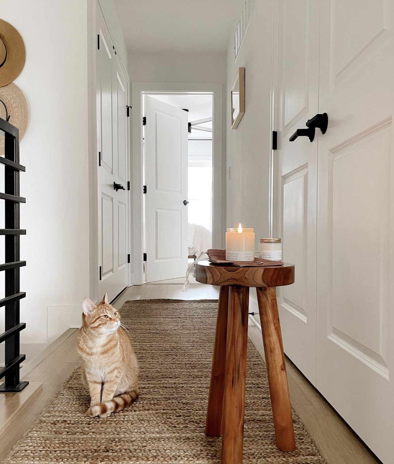
I’ll be the first to admit, my color palette of choice will always be neutral, neutral, neutral. It never goes out of style! Warm tans, soft whites, a fleck of black here and there, spark immense joy in my heart. We mix wood tones, but always on the lighter side. We accessorize with live greenery, and lots of it. We chose two hardware tones (black and gold) and stayed consistent throughout the house. These choices are the noticeable details of your space creating that cohesive consistency we’re after. These details are creating a feeling of comfortability and natural ease in every nook of the home.
4. LESS CLUTTER, CLEARER MIND
My husband and I have been working towards a minimalist aesthetic for a few years, only purchasing things we feel add value to the space. A stack of white coffee table books that are used daily to spark inspiration in my design career? Value added. A black and white wedding photo in a large wooden frame on the wall? Value definitely added. A black marble wine rack placed on our dry bar reminding us of the simple pleasures in life like a beautiful Cab Sauv and vegan cheese board? Value. Added. These items bring us joy when we see them everyday because they are functional and beautiful.
When it comes to items creating clutter and taking up space (mentally and physically), I say it’s better to hide those away (re: the million cat toys we’ve acquired for our 15 week old kitten, and the seemingly 100 remotes for the sound system my husband HAD to have). What are three items you can hide away (in each room!) that are not adding value to your space?
5. BRING THE OUTDOORS, IN
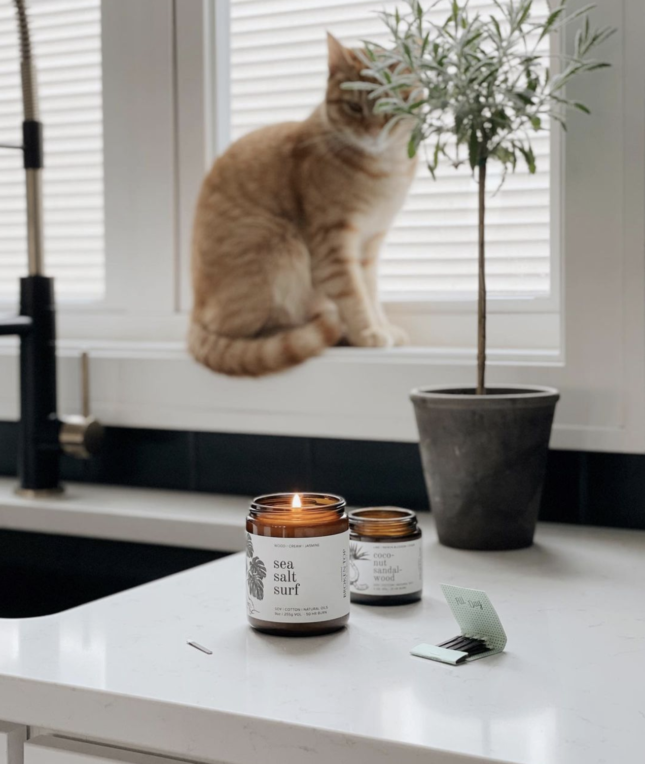
I’m a huge fan of plants. They bring life into your home, naturally detoxify your indoor air and give you something to care for on a daily basis. Not to mention, it’s extremely rewarding to watch something blossom and grow even more beautiful over time. We have houseplants in every corner, and this summer we started our first vegetable garden. Caring for these living things has given me purpose at times when my mental health wasn’t its best (especially during the beginning of quarantine). If you can relate, I see you and I’m with you. Plants, large and small, will always be my decor of choice, and when it comes to styling them, I always suggest going high and low. Hang a pothos high in a corner with natural, filtered light with plenty of space to dangle down (they grow FAST). Place a ZZ on a bench against a long, unused wall. And for my personal favorite, plant a large monstera in a bold, statement pot to become the focal point of a dining or living room. Now, what’s YOUR favorite houseplant?
Interior and graphic design will forever be passions I hope to infuse in every area of my life. The space you live in and create for yourself has a larger impact on your well-being than you may realize. Take it from me — if my space isn’t clutter-free during the work-day, I simply can’t focus and produce my best work.
If you have any interior design tips you’re loving lately, please share! Send photos of your space, or let me know which items you stored away because they were no longer sparking joy.


